
Awhile back, we picked up the “Crosby” floor lamp from World Market. This is one of the few larger dollar purchases I have made from a big box retailer apart from our occasional long-haul treks to Ikea. We tend to scour the local thrifts, junk malls and Craigslist for our treasures. But we were in need of light in that corner and a table and this just sort of happened one day.
Once we started to live with Crosby for a while, we realized he was a chameleon. And not so much in a good way. We love the color of our accent wall (SW Urbane Bronze) but putting the black metal Crosby’s little frame up against it just made him disappear.

Since Crosby wasn’t a priceless fancy-designer label or other sort of “don’t paint me” treasure, I went ahead and decided to paint him. It was either him or the wall and if I did the wall then I’d have to do the fireplace again and . . . you can see how I ended up picking the lamp. I had some muted matte gold spray paint left over from my Pinterest-inspired art and so I tackled Crosby with that.

And . . . it was better. But still meh. This picture is a broad daylight view that we rarely get to enjoy, being chained to desks at our offices from 8-to-5 like most corporate drones. In the evenings he still kind of faded away against the wall. I wanted something a little punchier. So I got a brassier, bolder hue at Lowe’s and sprayed poor old Crosby down again.
Finally a win! Now Crosby ties in nicely with our brass arc lamp from the auction last year (I had threatened to paint the arc lamp black but since it was vintage it got spared.) As an added plus, I’m starting to feel on trend (or dragging slightly behind it as usual) with all the gold/brass accents popping up in blog land everywhere. And in a few years when blue/white/grey/purple/whatever is the new brass, I’ll just spray him down again. Nothing to it.
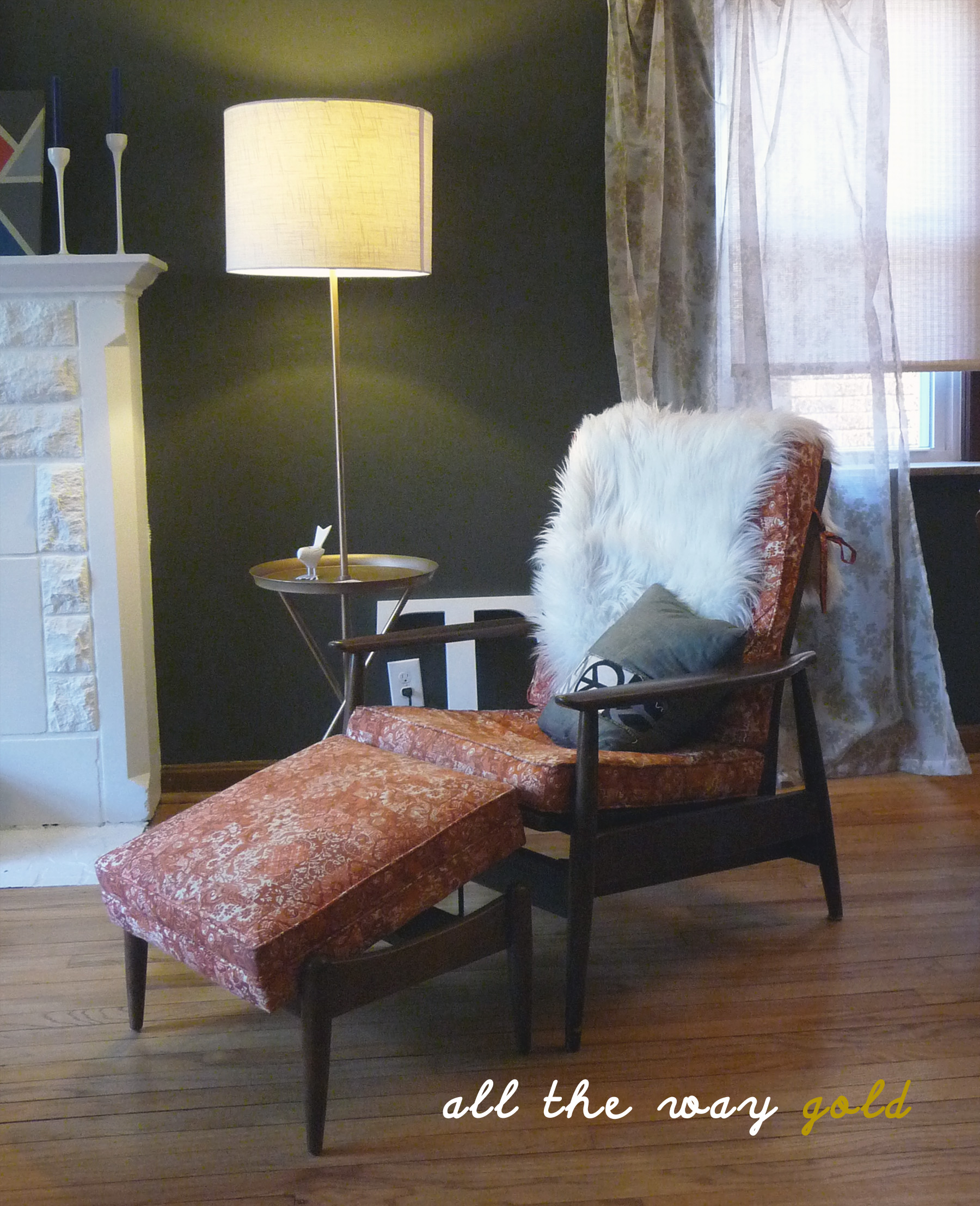
Also, since I’m sharing this view over and over again of the Baumritter “Man Chair” I’m adding some pictures of the tags on the underside of the ottoman. The internet connect me with a reader, Elliott, who was looking to see if the ottoman was intended to come with the chair. Our chair itself has no markings on it — I got pretty up close and personal with it when we did the straps and cleaned it off with the Restore-a-Finish so I’m 100% certain of that. What tipped me off that this was a Baumritter was actually the tags on the ottoman, like so:


The Adjusto Lounge or Style # 1617-1 Lounge. Hope this helps Elliott! I’d love to see any images of your Baumritter lounger — ours needs an upholstery makeover pretty badly.
Next up – some more Style Cure updates! Cheers – CT

I’m all for spray painting some of my accent pieces. I have several things, including a vase that belonged to my great-grandparents, that are on their umpteenth incarnation. My grandmother started painting that particular vase back in the 70s, and I’ve continued the tradition. It has been at least half a dozen colors over the years.
I love your table. It really stands out now against the Urbane Bronze, which was, incidentally, one of the finalists when I picked a color for the exterior of my house.
Thanks Dana! I love that you have inherited the tradition of re-painting a vase. I’m kind of in a “use what you got” phase right now and I think anyone (like grand-parents) who lived during the Depression really took the idea of repurposing and reimagining (and hoarding random things that you “might” need someday . . .) to the next level. I hope thriftiness comes back into vogue. Cheers – CT
I’m sure you’ve mentioned the SW color before, but maybe before my time. I love Urbane Bronze, and we just used it to paint all the steel – stairs / railings / columns in the big church renovation I’m just wrapping up at work. It’s also the color of the windows – and looks great indoors and out.
Thanks Kristin! I am in love with Urbane Bronze too — he’s the strong, silent type that always makes you look good without hogging too much of the attention for himself. Have a great weekend – CT