Category Archives: Design Diversions

Reading up this weekend?

Still under wraps with the gift crafting/creating thing.  Since there’s nothing to look at here, I thought I would point out all the design beauty going on around the interwebs.  The new hot thing seems to be online design rags powered by a pdf-ish program called Issuu.  Here’s a round-up of the ones I have in my favorites bar.

Lonny
Somewhat filling the void left by Domino, this is always an inspiring place to browse.

Rue
Hello Brad. 

Kinfolk
So far they have only launched one issue, but I really like this one — celebrating the idea of getting together with your loved ones for quality time over food.  What’s not to like?

House of Fifty
This one is new(er) to me, seems cool.

Matchbook

High Gloss

Covet Garden

Est

Heart Home

Anthology

and a Christmas edition


Have a great weekend everyone!  I’m going to be crocheting my fingers off and maybe starting to deocrate for the holidays.  No promises.  Enjoy!

Design for all . . . including dogs

I’m finally starting to get more projects finished up around the house.  A while ago I shared some images of our first artwork (here) and after looking over those pictures the wall still felt a little empty.

So I did what any obsessesd-with-monograms person would do.  I put a “T” on it.

I made my trusty little newspaper template and hung up one of my many letter “Ts” on the wall.  It felt so much more balanced — happier if you will.  But see that piece of wall on the other side of the kitchen door.  Blank.  Boring. 

It is no longer blank, or boring.  It’s for the dogs!

Sophie and Shenanigan got their own (handmade) artwork.  As a finishing touch I updated their placemat with the rest of the left-over table runner. (A story about why I hacked it up here.)

I’m not sure if they appreciate and/or enjoy their new artwork.  I think they only appreciate and/or enjoy all the dog treats I gave them to stand still for these photos.  I pieced together some paint swatch chips (Sherwin Williams Bosporus, Gecko and a couple of grays, can’t remember their names . . . ) and used a picture frame I already had lying around. 

Shenanigan, true to his name, was being squirrely and kept checking Sophie’s bowl for more treats.  Little monkey.

I tried for the life of me to get my models to cooperate for some better pictures but luck was not with me.    But with sweet little faces like this . . . .

. . . . it’s hard not to give them all the treats in the bag some day.  So I gave them some artwork instead.  Next up is a designer dog bowl.  Maybe for Christmas, if they’re good puppies.

Finally – a reveal! Kind of . . . .

Well folks, I had other projects and things to tell you about from this past weekend but the office/music room just can’t wait. 

It’s (mostly) done!

We put together the FLOR area rug and cleared out all the furniture orphans (banished to the basement with my ever-growing alley finds collection).

We managed to fit in all of JT’s amps, guitars and miscellaneous equipment.  Thanks to my luck at IKEA, we had an extra faux sheepskin to create a bench on our Gap sweater drawer (right now holding, you guessed it, miscellaneous musical equipment.)

This will be a great room for listening to our vinyl collection.  Although once it was all organized (alphabetically) on the shelf, the vinyl collection didn’t look so big.

I was finally able to get all of our books out of storage and organized.  Feels good.  The little black clip lamps came from our IKEA escapade as well.  I spray painted the wire pulls black as well to give it a little extra pop.

We’ve been hanging out in here all weekend.  Sophie and Shenanigan stayed away for a while because all the furniture re-arranging seems to frighten them.  But after things had been settled in for a little bit, they came sniffing around to see what was going on.

That may be one of my favorite pictures ever.

Sophie and Shenanigan love listening to music.  We call them studio dogs because they like to hang out while JT plays.

That’s Shenanigan posing with JT’s newest guitar.  I’m still not sold on it as he traded the Gretsch for it.  I really liked the Gretsch . . .  maybe I would like the new one better if JT would hurry up and make me an Explorer? (Hint, hint.)

Sophie seems to like it though.  Traitor.

So, for now, things are in good working order in the office/music room.  I still need to figure out a window treatment situation as the bamboo shades we have on the windows now don’t really provide privacy at night.  We did go look at the office from the backyard and alley and thankfully you can’t see the hanging guitars from the street.  I also have two more alley orphans downstairs awaiting money for reupholstery, so I want to eventually change out the two chairs for something more comfortable.  I also am working on lighting and a few other little projects.  My house will never really be “finished” though, so we’re going to enjoy the music room as it is for now.  It’s come a long way baby! 

PS — The before pictures are so horrible I didn’t want to put them up here.  If for some reason you want to assail your eyeballs, you can see them here.

PPS — If anyone knows of a good photographer in the STL area willing to barter me some good music room photos for design help on their own house, put me in contact.  My photos need an upgrade!

Flor-ed Part Deux

Before I lucked upon the FLOR carpet tiles at the thrift store last weekend, I had already been considering FLOR for our bedroom.

The blue colored area is what I had been dreaming about for some comfort on the wood floors.  But here’s the problem.

These two monkeys.  (We think) Sophie used to pee on one spot on all the rugs we ever put in the living room.  So we’ve been rug-less for the last three years or so.   I think that the FLOR carpet tiles will be a good solution for us and here’s why:  If Sophie pees on a tile, I can pull it up and hose it off or replace it with another.

I had ordered some samples before JT and I went crazy and decided to paint the bedroom blue.  So at one point I was thinking of bringing the color in through the area rug.

Now that’s out the window so I want something textural and graphic but not too crazy for the floor so I ordered a few more samples:

Yeah, #1 was too crazy, but I had been considering it for the office before the big score.  Isn’t it gorgeous though?  And those chairs . . . and that table . . .

Option #2 was much more subdued but still had that graphic punch.  For the bedroom I was picturing a warm gray to match the new sheets.  The only picture on the website had the much louder purple.  You can see how the cut pile and the loop combine to create a really elegant texture.


My favorite and the current leader of the pack is #3.  It’s a pattern called Sophistikat and I love it.  The only picture from the web has it in a delicious teal color but I think we will get it in the more neutral grey/tan colorway shown in my swatch.

Guess what – tomorrow is IKEA day!! One step closer to having this bedroom thing wrapped up!  After I posted the floor plan above, I realized that the only thing I had in this room originally was the black chair.

It was a gift from my grandmother when she downsized from her house into her condo.  I should ask her more about its origin as there are no markings.  I’m thinking about having another adventure in sewing and trying my hand at a tailored slipcover.  Not like you see the chair a whole lot, usually it’s covered in clothes.  Just keeping it real.

Have a great weekend everyone!  If you see someone hyperventilating in IKEA Schaumburg from over-exertion and general exhaustion due to awakening at 4am to drive there, it’s me!

Flor-ed

This weekend, between painting and moving furniture, I realized it had been a while since I had been to a thrift store.  The pull was growing stronger.  I couldn’t stay away any longer.

Off to the nearby St. Vincent de Paul thrift store for a quick fix.  The furniture seemed a little over priced.  I had my eyes peeled (gross saying I know) for a little mirror or something for the bedroom.  Instead I spotted this:

A whole table of Interface Flor carpet tiles, all boxed up.  Most of the patterns were not my cup of tea, but one caught my eye:

After I emailed my find over to my trusty Interface rep (the advantages of working in commercial interior design), he told me this was an old pattern called Jailhouse that used to go for $30 per square yard.  I had just bought a box of twenty 50cm tiles so about 6 square yards — what should have been $180 was $30.  We’re going to use this as an area rug in the music room/office. (The image below is an install shot from the Interface European website, it’s not available on the US site any longer. . . .)

There has been a lot of commentary on the passing of Steve Jobs.  I most certainly respect and honor Mr. Jobs’ contribution to technology — he definitely seemed to be a champion for form AND function — creating things that worked well and were well designed. 

However, another big CEO passed away this year — Ray Anderson of Interface Flor.  I think Mr. Anderson also “thought different” like Steve Jobs and pushed the boundaries of his industry.  Mr. Anderson wrote a book, “Confession of a Radical Industrialist” and understood that a eco-conscious company could also be a profitable company.  Interface Flor not only creates gorgeous carpet tile, it is a highly sustainable organization.  Plus and plus.

I was trolling around the Herman Miller website today for a work project and found an interesting article — “30 Successful Companies that Get It“.  Of course Herman Miller was in there, but so was Interface and Apple.  I hope more companies can “get it”.  Heck, I hope I can “get it” too! 

Start Me Up . . .

Once I started changing up the office/music room, I just couldn’t help myself.  So Thursday, after a discussion with JT, I popped out and bought a can of paint . . .
When I paint (lefty), I don’t know what to do with my free hand and I always end up with it on my hip like so  . . .

Here’s what’s gone down so far . . .
Elvis lives!  We really just have that taped back there to amuse a friend who spent the night on the air mattress one time.  Who can’t resist a little Elvis? (This girl :: points to self with thumbs::).

The “During” shot still needed another coat which I did yesterday.  My fabulous iPhone photography makes it hard to really see the color all the way, but I love it.  JT wants it for the bedroom as well so we’ll have a nice little sleeping cave.  It’s Bosporous by Sherwin Williams.  I’ll get some more (and hopefully better pictures) once the tape is down and the shelves are pushed back into place.  Because the office is such a dumping ground for all my furniture orphans, right now I am painting it one half at a time and shoving everything over to the other side. .  .

In other update news, my Missoni arrived!  Well really only part of it so I’m still skeptical as to whether the rest will ship.  But it works with the color scheme perfectly.
I think most of it will go to the bedroom but with me, it ain’t over ’til the fat lady sings. 

Speaking of singing fat ladies and Mick Jagger and Elvis, I saw 4 bands in three days this weekend and my legs are aching from jumping up and down for three hours straight.  I’ll post more about that later (maybe tomorrow, dunno it’s BUSY at work).

Have a great week!

Music Room comes (back) to life

Because I seem to have decorator’s A.D.D., I jumped from the bedroom makeover to the office.  The bedroom is still moving forward but I am waiting on some swatches and my MISSONI to ship in.  I don’t want to pick a paint color until I have some of the larger objects together and so . . . . I got bored and looked around the house for another project.  (JT and I have also started drinking coffee in the evening which has prompted much more caffeine-fueled work than I ever thought possible, which may be a big mistake.)

So, the office.  When we first moved in to our house back in 2005 (yes it’s been that long and I still haven’t accomplished anything!  But I’m working on it!)  it was our bedroom for about two weeks.  But we realized quickly that the front room was more private and moved things over.  The office had gone through many many iterations since then, mainly a furniture warehouse for all the things I drag in and out of the house. 

Case in point — these pictures I unearthed from a few years back when I started doing the Apartment Therapy Cure on this room.  It didn’t quite stick.  Here’s the embarrassing evidence though —The desk and vinyl MCM sofa have already made their way into the living/dining room.  Those two dressers are currently in the bedroom but headed out of Dodge to make way for the armoire and dressing table.  The lamps have also relocated to the living/dining room as well. (PS – I’m not a huge fan of guns, like at all, but those were my dad’s and right now we don’t know quite what else to do with them.)
For the two weeks it was a bedroom, we had painted it Sherwin Williams Decorous Amber, which is a nice burnt orange color.  Then I painted back a few of the walls to Amazing Gray (the color of most of the walls in the living room) and I thought I would paint the ceiling too.  It has since been painted back to white.  What a disaster!  As you can see, the office is really a music room and there is a lot of gear that needs a home.

Here’s what the office looks like more recently:

( You may have noticed from the photos that JT has revolving guitars going on, so he can’t really give me any grief about revolving furniture.  We’re a good match like that.)

We got that giant white/wood drawer from Warehouse of Fixtures — it used to be a sweater drawer in the Gap I think.  Great storage and JT’s speaker cabinets look nice sitting on it.  The mahogany piece sitting next to the drawer is on the way out and next to it is my future dressing table, which currently holds JT’s recorder/mixer thing and needs to be painted/made pretty before its debut in the bedroom.

Remember a while back I dragged home some more furniture from Craigslist?  Well on a coffee-adled binge last night, I convinced JT to help me start assembling/moving/changing the room around.  AGAIN.  And he agreed.  What a good husband.
It doesn’t look like much just yet . . . but it’s gonna!!! 

Here’s the plan —This New & Improved Music Room/Office has me excited for two reasons and they are both things I had on my 2011 New Year’s resolutions.

1.  I have always wanted a proper place to display our books (a library!) and now with the new shelving they can sit out instead of languishing in storage bins.  Also, all our vinyl will have a home too, yippee.
2.  I want to have a piano/keyboard/organ in the house to encourage me to work on my music more and for JT to master (he masters all instruments almost immediately).

Before we get the shelving all bolted together and settled along the one wall, this room needs a coat of paint desperately.  I’m on the fence right now between A) a creamy white that will blend the shelving into the wall B) the deep turquoise/teal/sapphire blue color that I’m digging right now or C) a nice gray color that I am leaning towards for the bedroom.  I think if I do Option B I may have to paint the ceiling as well, so that makes me a little nervous.  Anyone want to vote as to what color it should be?  I’d love to hear some input!

Ideas and Inspirations

Contrary to public belief, us designers do not often start out with a blank slate.  Often we are inspired by an image or an idea and evolve it into something new.  The great part is that inspiration is all around . . .

As I mentioned in the last post, our ink abstract is one of my favorite pieces in our house and also gives me a lot of design inspiration.  I pulled the teal blue color from the ink splotches to paint the front door and it spiraled into a whole new color palette for the house.
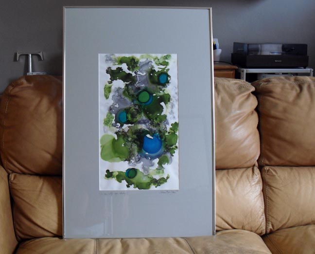
I have always been a lover of the color blue (case in point – sapphire engagement ring below! — I wear blue every day)  but up until now, didn’t really have any in our home.  Pretty crazy.  After already painting the front door and knowing I wanted to used some of the colors from our artwork to inspire the decor, I found this fabric swatch (in the image below left) at a local upholstery store (and it’s outdoor fabric so when I make it into some accent pillows they will be very dog friendly!)  When I got it home, I saw that the green in the fabric swatch was very similar to the nice lime-ish green in our artwork and I knew it was a match made in heaven.  The swatch also came with a helpful little color guide (isn’t color #1 a perfect shade of sapphire) that I snipped off and put into my wallet so I would have it with me at all times — just in case. That way if I am out and about and considering a pillow or some drapery fabric, I will know for sure if it will go . . . I also carry a little notebook with a list of things I am looking for (Saarinen table?) and measurements of my rooms and such.  It might be a little bit of overkill, but we’re talking about a person who has drawn her whole house in AutoCAD so I’m okay with an OCD/anal retentive label on this issue. 

Another place I get ideas and inspirations is from magazines.  I have a whole stack of pages I have torn out and saved away for future inspiration.  I kept that picture of the orange and blue kid’s bedroom on the top of the stack because of the amazing herringbone carpet.  (Because I am anal retentive I also try to write on the page a comment about why I tore it out because sometimes when I go back to them 6 months later, I’m not always sure.  My tastes can change that fast.  Yikes).

I also keep a folder on my thumb drive called “Ideas and Inspirations” and am always right-click saving anything I see online that catches my fancy.
When I save an image from the internet, I am trying to get better about keeping its source location and/or who created it so I can possible share it here on my blog later.  Since I’ve had this file for a while, not all of my images are very well tagged.  I’ve been using Tin Eye to do reverse image searches and that has worked out about 60% of the time.  You can see my obsession with the letter T is not limited to 3D objects and has crossed over into fonts as well.  I need help.

Another inspiration image for our new house palette came in the mail at the beginning of the year and since January (and still) I have had my PPG calendar turned to the April/May/June page. 
I love the teal/turquoise color along with the rich leathers, glossy white light fixture and all the old books.  It also had a nice color palette along the side but I knew the yellows and browns would not be right for me. 

I also have loved getting a “robot phone” or an iPhone as most people call it because then I can capture ideas or things I like where ever I am. 

I took this image (another illustrating my crap photography skills) on a trip to Kansas City.  We stopped in at a new(er) restaurant, UnForked, and I really liked the warm industrial/funky atmosphere they had going on. The food was really good too so that helped. 

How do you guys find inspiration?  How do you remember/save/recall your ideas and inspirations?  Are you as OCD as I am?

Our First Art

One of my favorite things about visiting a new place is seeing what kind of art museum(s) they have to check out (much to the chagrin of my husband, who does love art but more of the aural variety).  Visual inspiration is all around.  Once JT and I established our house, I began looking for some visual inspiration we could bring into our lives and call our own. 

JT and I have a very small (and hopefully growing) art collection.  Our first real art purchase is the ink abstract piece that hangs in the dining nook right now.  (I say right now because I’m thinking about rearranging and creating an art wall.  We’ll see.)  It is titled “I Am With You Always” by Melanie Blunk Dolan.

Not only do I love love love the color palette, the name of the piece itself also really speaks to me.  Having lost my father over 7 years ago, this is a bittersweet reminder to me that I have the best guardian angel a girl can have.  
It is just perfect in the mat and frame that Melanie delivered it in.  However the protective acrylic makes it hard to photograph well (not that I have ever taken such great photographs to start with . . . )  We used to have Johnny Cash print hanging in that spot but that meant that one of the first things you saw upon entering our home was Johnny Cash flipping you off, so he moved his vulgar self to the music room where he is much more appreciated.

When I started this post, I wanted to include more information about the artist. JT and I first saw her abstract ink collection displayed at Murdoch Perk (home of the best spiced mocha ever).  But that was over two years ago and her work was only on a display for a month (after which JT purchased “I Am With You Always” as an anniversary gift, so sweet.)   I jumped around the inter-webs, my constant source of factoids, and came across the blog of fellow St. Louisan  Neil E. Das.  His pictures make me want to cry – tears of jealousy and marvel at being able to take such beautiful beautiful pictures while I fight a losing battle against my camera every day.  Along with breath-taking pictures and insightful writing and haikus, there was also the following artist statement by Melanie.

Artist Statement

Creating ink abstracts is liberating. These abstracts released from within have given me renewed freedom and enthusiasm for life. I believe an artistic talent lies dormant in each of us; my desire is for others to experience through the color and flow of my work a sense of freedom and joy that leads to the discovery of one’s own talent.

Abstract inks are surprises–like life. Each painting is a gift with an unpredictable fusion of color. Sometimes the colors blend; sometimes a color overshadows another; and at other times one color graciously moves aside making room for a passer-by. Life, like the ink, asks me to stay in the moment accepting that I am not in control. Once I surrender, an unforeseen creation emerges.

My hope is that you will be inspired by my work. Comments are always welcome: mendee314@sbcglobal.net

I agree with Melanie — there is a creative person inside of each of us.  What we choose to do with that creative self is different for everyone.  I am lucky to use my creativity daily both in my job and in tinkering with things in our home and then boring the internet with all the details.  Good times.  I also have a strong appreciation for the creativity of others and I love to be surrounded by beautiful, visual things.  That’s why I’m so glad we stumbled upon Melanie’s work and wanted to share it with everyone.  To me, that’s the way to bring art into your life — find something that speaks to you, whether through the colors, shapes or composition and it will always be at home where you are.

Happy Monday — have a great week inter-webs!

Target is killing me!

Okay, so that post title may be a tad on the dramatic side.  However, I had today, September 13th, saved on my Outlook calendar for one reason: Missoni launches at Target!

Ever since I saw the blue/white/green flame stitch/chevron stash box in their look book, I have been waiting for this day to make it mine.  I want to use it for inspiration colors for our soon-to-be-revamped bedroom.  I want some iconic Italian design for my house!   So I have been quietly waiting for my chance to bring it home.
Here’s what Target told me at 7:00am:

Oh no is right.  Here’s what they’re telling me now:
Now they’re too popular for me. 

Here’s what I’m telling Target: if you sell out of my stash box before I can even get on your #$$@&% website, we are going to have some trouble. 

While I couldn’t get to Missoni, Target did let me look at its weekly ad.  (Gee thanks, Target.) 

Freshen up for fall with frugal?  Um, what?  Wouldn’t the essence of frugality be not “freshening up” at all?  Or better yet, doing it at Goodwill?  Just a thought . . . .

Update:  Not 10 minutes after I hit publish on this post, the “Woof” had been replaced with a working website.  Then in the middle of my checkout, it stopped working.  I popped open another browser window and got my credit card info in.  Who I actually gave that to is debatable, fingers crossed a package will be showing up on my doorstep by September 19th.  I’m sorry I ever doubted you Target.  Let’s be friends.

Update update:  Apartment Therapy did a great post on Missoni-Geddon here.